I have some more unsettling news to share with you. There is a reality that we as Westerners fail to truly grasp about the world. You see, contrary to popular belief and the perceptions of many third-world countries dependent on American exports, the United States of America is not the center of the world, nor is North America/Eurasia the largest populated continent on Planet Earth.
Since the dawn of the Age of Discovery, man has sought to disregard and discredit the land once known as “The Dark Continent.” History has sought to rewrite the history of the African people as one having started in chains, with total disregard for the fact that the ancient empires of Khemet [Egypt] and Aksum [Ethiopia] were, in fact, African (meaning operated and populated by blacks).
Feature films like The Egyptian (1954), Land of the Pharaohs (1955), The Ten Commandments (1956), Solomon and Sheba (1959), Ben-Hur (1959), and Cleopatra (1963), have all depicted ancient Egyptians [other Africans, and Israelites] as European in appearance, an action which effectively conditioned the world into presuming that the same “savages” that were brought over to the Americas in chains could never have accomplished such historical feats that the European Romans themselves essentially built their society and religion around. Ricky, what the heck are you talking about?
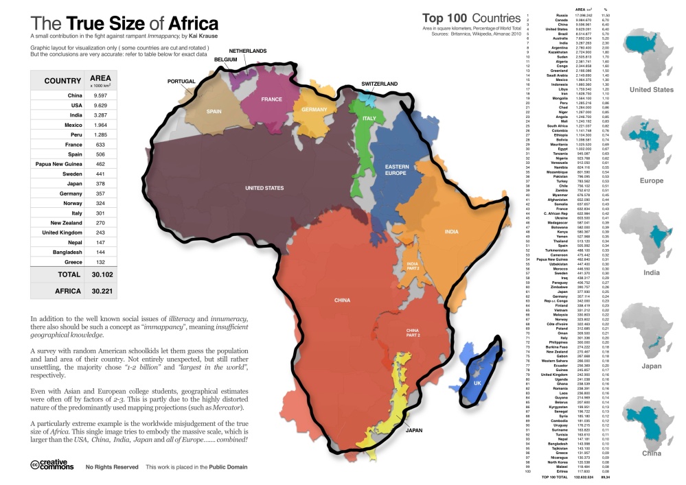
We will table that discussion for another time [trust me, it’s coming, and soon]. This concerns Africa and its perception. Looking at typical maps such as the one below, you will easily draw the conclusion that Africa, the land where science theorizes all of mankind originated from, is not comparable in size to the continents upon which Western Civilization is built. This could not be more erroneous and criminally incorrect.
Pull out your chairs–it’s time to watch The West Wing.
I watched this years ago in passing, not realizing how legitimate this was.
Africa is an extremely large continent and the most biodiverse continent in the world. It is the source of life. It is the cradle of civilization. Despite the continued post-colonial effects on the land caused by European settlers, Africa continues to be an exceedingly rich land. In fact, I am willing to call it the largest inhabited continent in the world. It is a brazen statement, I know, but someone had to say it.
Here is the map you are likely familiar with: As shown in the above West Wing clip, this is known as the Mercator map, projected by the Flemish geographer and cartographer Gerardus Mercator in 1569. Are your ready to have your mind blown?
Get ready for the most exciting moment of your life.
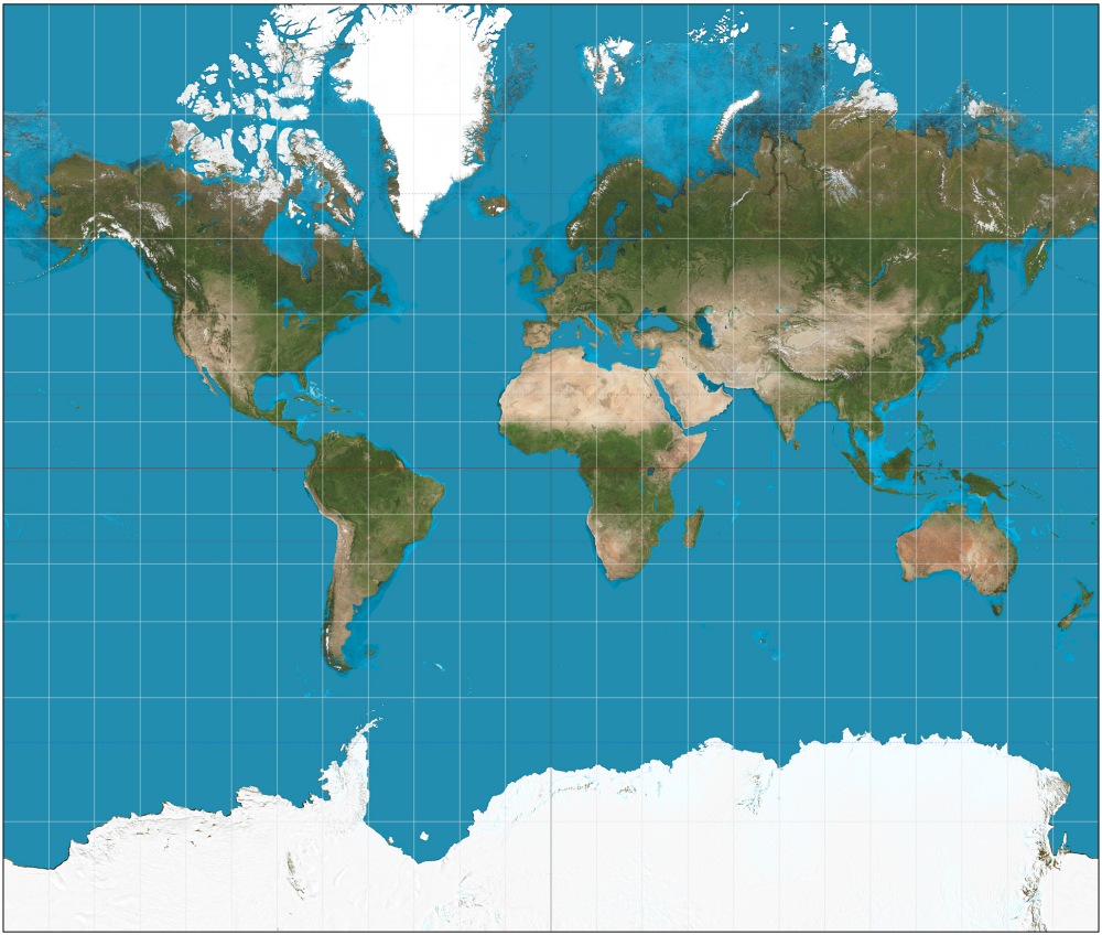
Remember what we talked about above? Something about Africa seems a bit off. Antarctica looks absolutely enormous. Alaska absolutely DWARFS Mexico. This is horribly inaccurate. As stated in a 2014 Daily Mail article,
“The Mercator projection, the map most commonly seen hanging in classrooms and in text books, was created in 1596 to help sailors navigate the world. The familiar map gives the right shapes of land masses, but at the cost of distorting their sizes in favour of the wealthy lands to the north.”
“To help sailors navigate the world.” Yes, you read that correctly. History is a tragic tale of colonialism, subjugation, and slaughter, as much as it is a tale of exploration, new frontiers, and development. There is a system here that cannot be ignored, and race plays a major factor. A 2014 article in The Guardian explains further:
“These maps of Africa, drawn up by a small group of western cartographers, symbolically reinforced Europeans’ sense of control over their mapped territories and subjects, but they didn’t betray much in the way of real information. Though they would have been seen as objective and impartial at the time, in retrospect it is clear how subjective, ideologically driven, and, in many ways, fantastical they were.”
Besides the initial chart, is there a map in existence that gives us a more accurate look at what the world (and Africa) really looks like, especially the recent advances in science and geographical mapping? I’m willing to bet there is.
“As is apparent in the Gall-Peters equal projection map (below), you can fit north America into Africa and still have space for India, Argentina, Tunisia and some left over. Greenland, meanwhile, is 1/14th the size of the continent.”
That’s a pretty significant scaling error. Seriously. Now that this map has refreshed your memory, let’s take a look at the Gall-Peters map mentioned just above, a map scaled to better reflect the chart at the top of this post and reality. Here it is below.

Notice a difference? There is no doubt that these lands are enormous regardless, but Africa is substantially larger than what conventional wisdom would have you believe. As the world continues to progress, we must all strive to seek knowledge and cultural righteousness. Perception goes a long way in the development of a worldview.
Granted, films portraying historically African figures continue to be whitewashed [the 2014 Christian Bale epic Exodus: Gods and Kings and the upcoming 2016 film Gods of Egypt, for example] in this day and age, and the civil rights of Africans and African Americans the world over continue to be called into question, but a time is someday coming where these misperceptions will soon sink into the same ocean the souls of many innocent Africans currently reside as a result of the African Holocaust.
Africa is much more impressive than you originally thought.

Cool post, I was just thinking few days back about the size of Africa and thought: “Oh my god, 90% of whole population must think that Africa is so small!”
LikeLike